Woolroom

It's no secret that I'm a big fan of my bed. There's nothing I like more than an early night with a cup of tea and a good book. I'd like to say that this habit has crept up on me as I've got older but the truth is I've always been like this and have always much preferred snuggling at home than going out. Woolroom certainly picked the right person when they asked me to choose some items from their 100% wool bedding to range review! I chose pillows, a mattress protector and a duvet and got to work with lots of lovely early nights! I like to take my work seriously!

IMG_4628.JPG

The Mattress Protector.

We chose a mattress protector rather than a topper as we already have a built in memory foam topper on our mattress, The protector is lovely and padded and immediately added a layer of comfort that I didn't realise I needed and wasn't really expecting. It makes the bed feel a lot more luxurious and expensive, like a bed in a high end hotel.

The Duvet

We chose a Classic Wool Duvet - Light, as neither of us likes to be hot at night. The duvet feels lovely - thick and luxurious but is not heavy on your body. The 100% natural sheeps wool regulates your temperature so that you feel cool when it's hot and warm when it's cold. I'd say that we definitely experienced this benefit. I haven't woken up feeling too hot or too cold once since using this duvet (but I have been woken up due to sleepwalking kids and wriggly dogs, as usual!)

IMG_4634.JPG


The Pillows.

We received two pillows from Woolroom. My husband is super happy to have both of them as he loves to sleep on several pillows at a time. He loves the density of the pillows and the way they stay at a constant temperature.

IMG_4635.JPG

So, after seven nights of sleep in with my The Wool Room bedding I am very happy to report that we have defintely slept well! We don't don't feel too hot or too cold - we feel just right. Is this the Goldilocks effect? The bedding feels sumptuous and luxurious and the mattress protector makes us feel like we're sleeping on a cloud. I even managed an unplanned sleep in on Sunday morning which is rare for me. There is one negative of owning Woolroom bedding though and that is that it spoils you! I had to spend one night away in a less than salubrious hotel bed this week and I felt every single lump and bump in that bed - I'm sure I wouldn't have been such a 'Princess and the Pea' before my Woolroom bedding came along! 

This is a sponsored post for Woolroom.

Revamp Restyle Reveal

IMG_4459.jpg

Thanks Meera (Arty Home) for sending everyone over to read my Revamp Restyle Reveal blog post next!

It's no secret that I love Instagram and the boundless opportunities that come from it if you're willing to grab them. So when I was offered one of the ten blogger spots on Revamp Restyle Reveal I said YES PLEASE! I decided to revamp my ten year old son Theo's room as it hadn't been touched since he was a baby and still had a Cath Kidston 'Cowboy' theme going on (which I still love, by the way!). The Revamp Reveal Restyle sponsors all very kindly allowed us to select products from their websites to an agreed budget. This was great as we were then able to work with products we genuinely loved. So after a summer spent poring over their websites, we made our choices and got started at the beginning of September.

IMG_3518.JPG

Theo's wish list - grey, a bigger bed with built in lighting, a desk, some vinyls on the wall.

My wish list - something neutral but fun, that could be updated easily as he gets older without redecorating. As always, I wanted it to be a bit different to any other boys room I'd seen already, with a bit of a seventies, retro feel to it.

Theomoodboard.jpg

We chose Earthborn Paints 'Cats Cradle' as the main colour -  a perfect mid grey. The room is small so I wanted to employ a few tricks to make the room seem larger and painting a line along the wall creates an illusion of space. We chose white for the top half of the wall as it's an obvious space creating colour. 

IMG_4184.JPG

We painted all the walls Earthborn Paint - White at first and then drew a line along the wall with a spirit level and a pencil. We had to be careful with the line as the house is 120 years old and consequently there's not a single reliable striaght edge!

The paint went on like a dream- the white is a lovely, warm off white and the grey only took ONE coat to cover the walls. Thanks Earthborn for giving me the chance to try out your paint - I absolutely loved the shades and the quality of the paint.

We loved the line effect and it immediately made the room feel larger and airier. It also gave us the solution we needed for a bookcase for Theo. We had an old one knocking about that was destined for firewood. Rob had the genius idea of painting the bookcase in exactly the same way as the wall and of course it worked a treat. I'm just mad jealous that it wasn't my idea!

IMG_2023.JPG
IMG_2028.JPG
bookcase.JPG

We chose the Arvid Metal and Wood Pendant Lamp from Maison Du Monde as the main light for the bedroom. I like these sort of pendant lamps as they cross over a number of genres - they work well in an industrial scheme for instance but also look great in a mid century room or a Scandi inspired room. I love these sort of multi-role accessories. The pendant is quite large for the room but I think that's fine - I also think that playing with scale helps to make a room look larger. Again, I'd never tried Maison Du Monde products before but I was really impressed by their wide product range, prices and customer service.

IMG_4491.jpg

Next up we assembled the solid oak Ghost desk that we'd chosen from Maison Du Monde. Rob is an engineer so is very precise about following instructions and he was very impressed with the assembly instructions for the desk and the letter coded kit bags!

desk.JPG

Once assembled, it fitted right in and immediately added a classy, grown up vibe to the room.

Theo starts senior school next year so it was really important for him to have a special work space. AO came up trumps brilliantly with a Hewlett Packard laptop for his school work and he's totally over the moon with it. In fact, all the kids are fighting over it!

IMG_4478.jpg

We ditched the old Ikea wardrobe in favour of the Winston Metal Clothes Rack from Maison Du Monde. I love the idea of having clothes on display (I think I must have been a visual merchandiser in a former life) instead of hidden in wardrobes. However, it took up too much room and with hindsight, hanging clothes for boys is a waste of time as they always immediately trash them anyway. He has clothes storage in his chest of drawers and now in vintage trunks under his bed too. The clothes rack will be absolutely perfect in my thirteen year old daughter's room, which I'm doing next.

Talking of storage - as the bookshelf had been, in my opinion, such a roaring success we decided to revamp an old chest of drawers in the same way. It was already black so we just painted the carcass in 'Cats Cradle' and left the drawer fronts black, like the blackboard.

IMG_4381.jpg

This chest of drawers was tip-bound from a house clearance years ago, so I rescued it for my first house and painted it peach! Don't judge me! Since then it's been lilac, white, orange, black and now grey! It's a good, solid piece of post war furniture so why chuck it away when you can make it fit in with any new scheme with a lick of paint?

At this point it was obvious that the orange pine bed stood out like a sore thumb next to our glorious grey and the sophisticated oak of the desk. So, at the last minute, and with only two days of the project to go, I decided to paint the bed!

IMG_4524.PNG

At the same time, Cheltenham friend Catherine Colebrook sent me a picture of her son's door which she'd previously painted two tone like our bookshelf. One look and I KNEW I had to do the same on Theo's door- and of course, why not the window too for continuity? Rob was incredulous and issued me with dire warnings about absolutely not painting the door with the line thing because the floor drops there (remember - no straight lines in this house) and ends of the line won't meet when joined up. Then he went away on a course with work. So I did it anyway! 

IMG_4445.jpg
IMG_4452.jpg

So Monday and Tuesday was spent frantically painting the bed, the skirting boards and the door in Cat's Cradle. Rob was right - the lines didn't join up but I've disguised it in the door frame! Rob is not happy. But I am - I've been using the same 5L tin of Cats Cradle for the whole room and I've still got loads left! Painting the skirting boards is another great way of adding the illusion of height and space into a room - the eye goes all the way to the floor, rather than stopping at the skirting board.

IMG_4511.jpg

Once all the painting was done we began to dress the room. The beautiful, modern but timeless Muuto 'Leaf' light from Amara was placed on the Ghost desk from Maison Du Monde and looks so elegant.

IMG_4517.jpg

We also added the Santiago Leather Armchair in Camel from Maison Du Monde. This is for Theo to use as a reading spot and it's butterfly shape is also another one of those iconic designs that fits into lots of design schemes.

IMG_4477.jpg

Finally, we added orange and yellow accessories for colour and fun, removable skateboad shelves for practicality and fun, an old camera, old discs onto the wall at Theo's request and some LED strip lighting under the bed for night time mood lighting.

desk1.jpg
IMG_4487.jpg
IMG_4500.jpg
IMG_4507.jpg
IMG_4509.jpg
IMG_4494.jpg

Customer Feedback - Theo Campling,aged 10.

'Mum, I knew this would be good but it really exceeded my expectations'. (Awwwww!)

'Mum, you and dad have worked so hard on my room, it's made me feel really special'. (I think my eyes are leaking a bit).

'Mum, you and Dad have worked really well together on this project, you ought to work together more often!' (Yikes!!)

Thanks to:

Sponsors.jpg

Shed of the year 2017

I’m a lifelong fan of the outdoors and I love blurring the lines between inside and outside when designing a space. I like to bring natural materials such as raw woods, plants and natural textures inside and I like to treat outdoor spaces in the same way I’d treat an indoor room. So when Cuprinol asked me if I’d like to decorate and furnish a shed in conjunction with ‘Shed of the Year’ on Channel 4 I jumped at the chance! We didn’t really need a shed however, but for a long time we had wanted to build after a veranda type space at the bottom of the garden. We knew that this would be a fun summer project that wouldn’t take long as we have lots of friends and family who would help us out.

before.jpg

Cuprinol loved the idea of a veranda as it shows that it’s not just sheds that can be made over into fun outdoor spaces. Any covered space outdoors can be made into an outdoor room with a lick of paint and a bit of imagination. So, instead of a shed, we bought the materials needed for the veranda from B & Q.

My initial inspiration for the veranda was the ‘Woodland Stargazer’, a finalist in the Eco Category on Cuprinol’s ‘Shed of the Year’.

Stargazer.jpg

Owned by Annie Maclean in Fort William, the Woodland Stargazer is an off-grid tower hidden in woodland near the owner’s cottage. The roof is glazed to allow for stargazing and the whole building is built from recycled or sustainable materials. I was very inspired by the fact that it’s an all year round space that you can escape to be close to nature. It doesn’t have to be summer. It’s furnished cosily and comfortably and has a built in log burner to keep you warm all year round. And I love that you can see the stars through the glazed roof.

Obviously a veranda is quite a different building, but I wanted the all round living and being close to nature aspect of it. My aesthetic inspiration for the veranda was this image by Caroline Le Grand Design on Pinterest:

Le Grand.jpg

I like its simplicity, how it blends in with the scenery, and how it’s furnished like a normal room.

So, we started to source the materials needed from B & Q. We decided on 4 upright posts to support the roof. Grange Softwood Pine Post (H)2.4 M (W)90 mm, Pack of 4

posts.jpg

We then sourced more wooden posts from B & Q to create the frame to support the roof: Constructional Timber | Timber & Sheet Materials.

roof frame.jpg

A supporting length of wood was then fixed to the fascia board on the garage to support the frame.

roof frame 2.jpg

Once the roof frame was in place we sourced roofing material. We decided on corrugated bitumen from B & Q as it is harder wearing than corrugated plastic, comes in large, easy to handle, sheets and is less noisy when it’s raining! Black Bitumen Roofing Sheet 2000mm x 900mm

roofing.jpg

We then painted the whole structure in Cuprinol Garden Shades in ‘White Daisy’. We applied two coats – it went on very easily and provides excellent coverage, but still allows the grain of the wood to show through. This keeps it looking very natural, yet light. Cuprinol Garden Shades White Daisy Matt Wood Paint 2.5L

painting.jpg

We then painted the wall of the garage in two coats of White Masonry paint- Weathershield’s Pure Brilliant White Masonry Paint provides great coverage!

FullSizeRender.jpg

We had planned to use reed screening on top of and the underside of the roof but decided that the roof looked best white. Instead we used the screening to give a better finish to the fences either end of the garage. Reed Screening Roll 2 M 4 M

The floor is yet to be done so we laid down plastic and used some of our rugs to create a defined floor area.

flooring.jpg

I then used furniture we already owned or sourced vintage and reclaimed furniture to dress the space. We decided to split the space into three – a living area, a dining area and a ‘cooking’ i.e. firepit area.

area divide.jpg
fluffing 1.jpg
firepit.jpg

The space was quick and easy to create and cost around £400. As the nights get colder we plan to install a woodburner / pizza oven and embrace the Danish ‘Hygge’ principle – wrapping up warm, drinking mulled wine and lighting the fire and candles -  to keep the space useable.  There’s no need to glaze the roof like ‘Woodland Stargazer’ because we can see the stars through the branches of the old apple tree next to the veranda. It’s a very versatile space and I can see it being used a lot in the future for book clubs, dinner parties and children’s parties, as well as peaceful evenings looking at the stars and listening to the owls in this quiet part of the garden.

final pic 1.jpg
final pic 2.jpg

Shopping List:

8 x Coraline Corrugated Bitumen @£17.50 ea

1 X Cuprinol Garden Shades White Daisy @16

12m of Fencing Posts 10cm X 10cm @£50

40m of timber 5cm X 7.5cm (for roof) £112

Bloom Reed Panel X 2 £50


This post is a sponsored post from Cuprinol and Dulux UK.

Inside Out and Outside In

I have always loved the idea of bringing the outside inside at home. I love using plants, logs as side tables and plant stands and branches as decoration. I favour natural textiles such as sheepskins, sisal and wood around the home. Not only do they add character and texture, they're inexpensive and often free - I can often be found foraging the woods for a perfect height log and have been known to stop the car on the M20 in order to scoop up a nice looking silver birch branch from the verge!

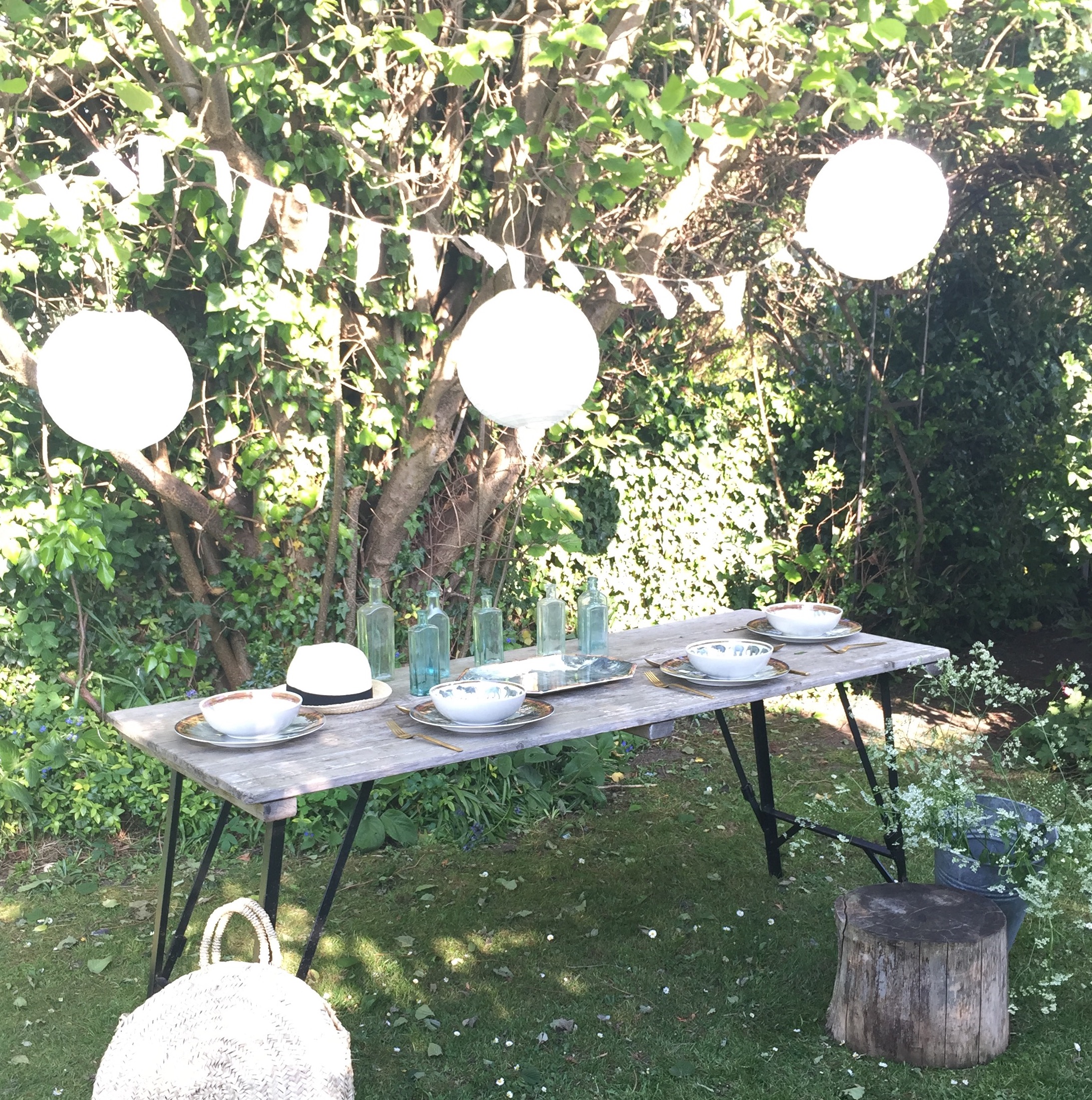
Equally, I love taking the inside out and treating the garden as an extra room. Fairy lights and festoons in the trees, outdoor sofas and outdoor dining spring to mind. I always look for multi purpose items that work equally well inside and outside. In these times of austerity, I really think that the items we purchase need to have multiple uses so that they work hard for their money.

Camping in our bell tent gives me a whole new room to decorate and I don't hold back! Rugs, crates, belly baskets, vintage suitcases and crochet blankets all get piled into the van when we go camping and all get used to make the bell tent a home from home when we're away.

So, when Marks and Spencers asked me to choose some of their new Outdoor Living range to play with, I jumped at the chance.

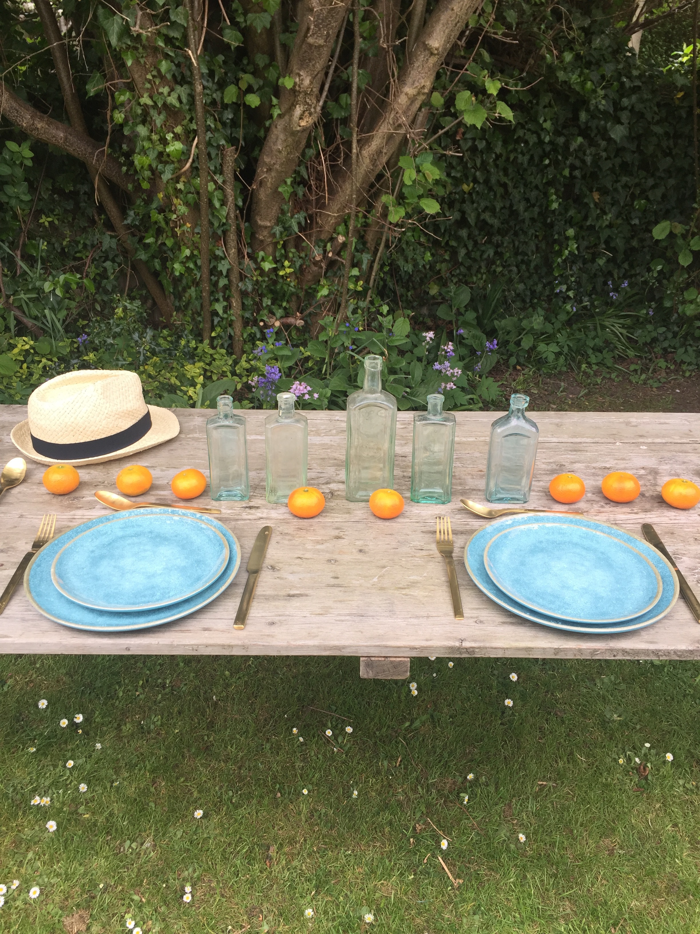
I chose the Azure crackle glazed melamine plates and side plates. I love that they're solid and chunky and that they look exactly like real vintage china.

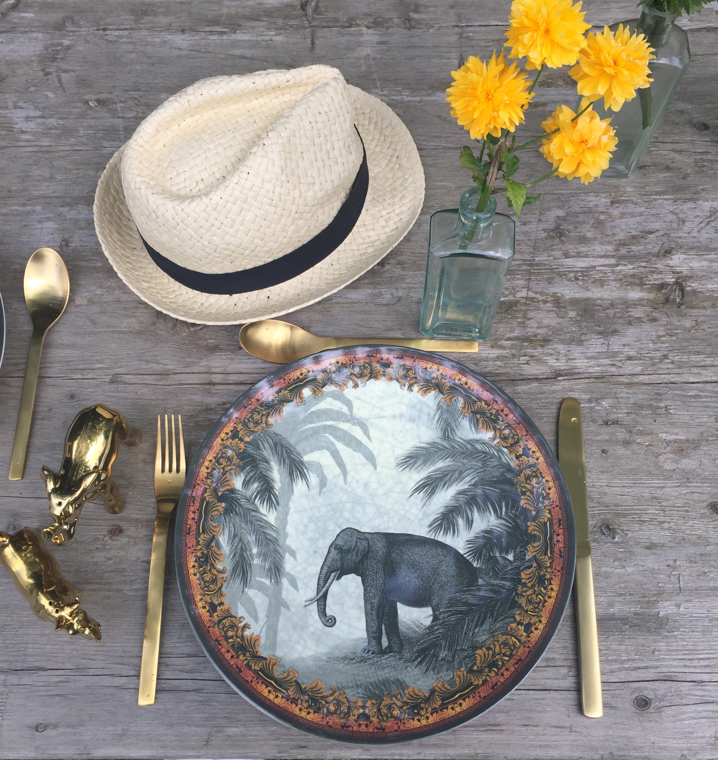
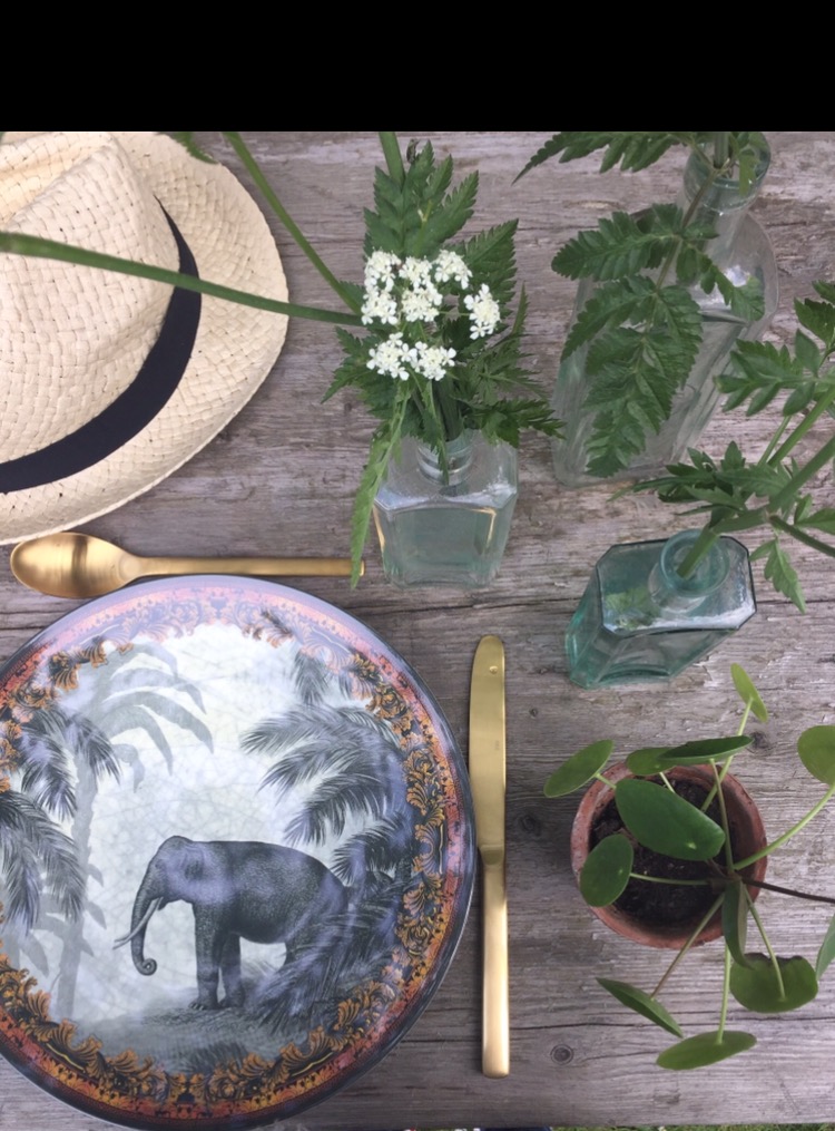
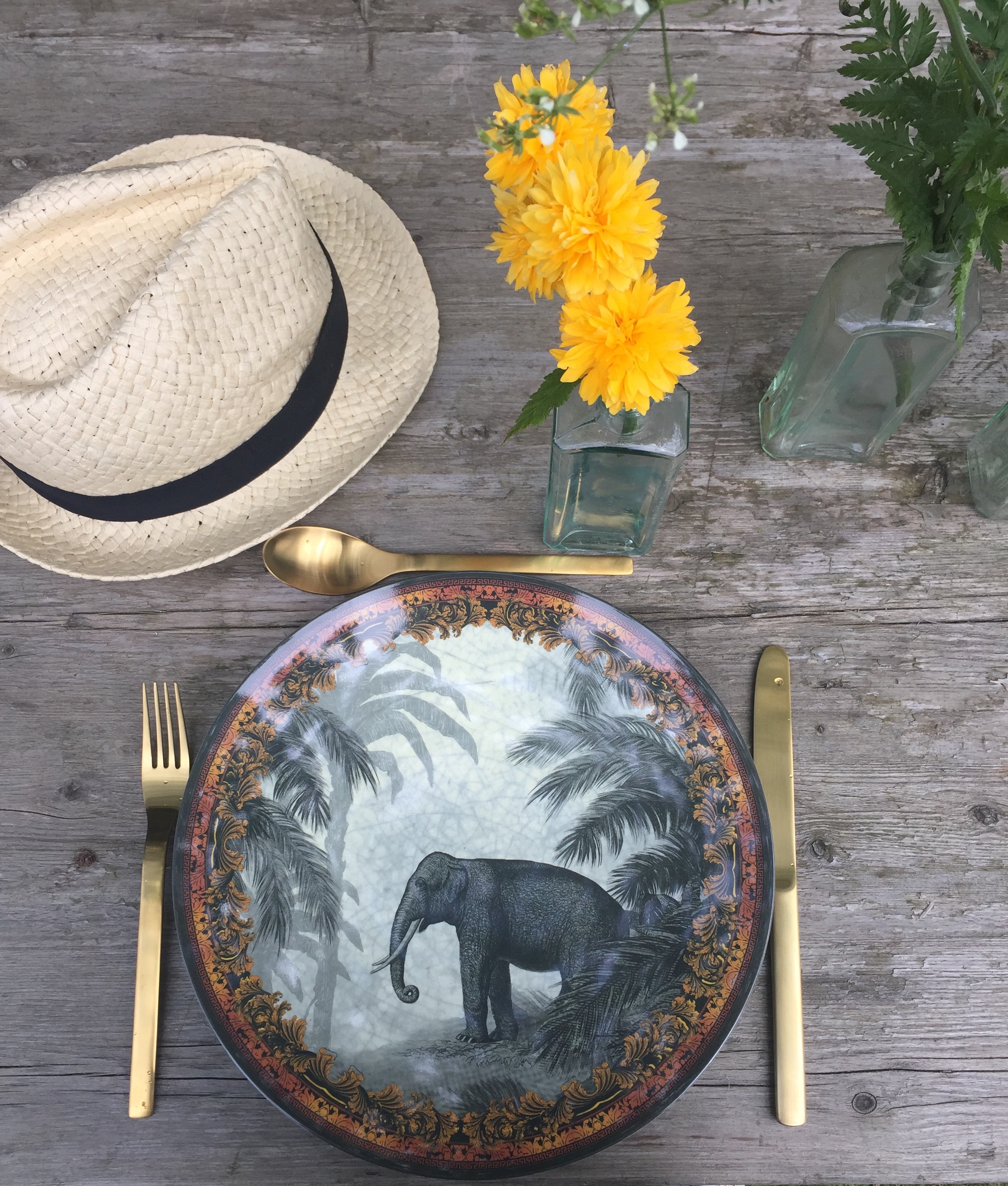
I also chose the Safari range of melamine. Again, good solid quality that looks like real china. The safari theme is absolutely beautiful and picks up perfectly on the interiors trend for plants, looking equally good inside and outside.

I styled both sets of melamine with the gold brushed Astoria cutlery set and gold Rhino and Elephant salt and pepper sets.

Marks and Spencers have really nailed the the inside out and outside in brief with this range and the matching gold accessories definitely put the glam in glamping. I will be using all of it for dining this summer, whether it's inside or outside.

Product Range:
Crackle Effect Melamine Plate - Azure
Crackle Effect Melamine Side Plate
Safari Melamine Dinner Plates set of four
Safari Cereal Bowls set of four
Astoria Gold Cutlery 16 Pieces
Rhino and Elephant Salt and Pepper Mill

This is a sponsored blog post. However, I only ever post about things I genuinely like and would have in my home.