Shepherds Huts - Small Spaces : Endless Opportunities

Bespoke shepherds hut by Leckhampton Shepherds Huts. Pic credit: www.danduchars.com

Shepherds hut dreaming

Who hasn’t dreamed of escaping to a cabin in the woods - a place where you can shrug off the world for a few hours and instead relax, read, write, stargaze, cook or sleep.

And who hasn’t craved a spare space in their garden at home for work, or for putting up guests, using as a gym or accommodating a growing family?

Well, with a shepherds hut , all of these possibilities are within reach. They are the ultimate attractive, affordable, multi purpose space or extension to your home and, even better, if you move house, you can take them with you.

Micro cement shower room, cedar clad ceilimg, tongue and grrove wall cladding, pocket doors - just some of the design features that can be included in a Leckhampton Shepherds Hut. Pic credit: www.danduchars.com

History

Shepherds huts were originally designed in the 15th century and used through to the 19th century for shepherds to live in. Shepherding was hard physical work in those days and sheep were moved daily in order to keep the land grazed and fertilised. The shepherds hut was a kitchen, dining room, bedroom, sitting room and storeroom all in one. The designs varied but all were constructed to provide the shepherd wih practical and durable accommodation. The old huts had a stove in one corner for warmth and cooking and a window on each side so the shepherd could see his flock. A hinged stable door, which was always positioned away from the prevailing wind, enabled him to hear his flock and strong axles with cast iron wheels were used to withstand the movement from field to field.

125 year old restored shepherds hut. Pic credit: www.dailymail.com

Then to Now

It is this ruggedness and durability that makes shepherds huts stand apart from other outdoor accommodation, such as caravans. New shepherds huts, such as those built by Leckhampton Shepherds Huts (pictured), take the durability and flexibility of the old shepherds huts and elevate them to high quality extra accommodation with high end finshes such as cedar clad ceilings and luxurious touches such as heated flooring. And bathrooms of course! They are less rustic and ‘make do' and more interior and exterior design design led with innovative mechanisms, custom made furnishings and bespoke interior styling. And, with regular maintenance, they last for generations.

Leckhampton Shepherds Hut. Photocredit: www.danduchars.com

Multi purpose home extension

Shepherds huts bridge the gap between temporary outdoor rooms and home extensions. The price of building home extensions has increased sigificantly in recent years due to material and labour shortages and if you cannot afford this then a bespoke shepherds hut could be the solution. Once again, shepherds huts are not necessarily rustic buildings but can be sleek, modern and attractive additions to your home. Need a studio, office, space for growing teens or even ageing parents? Shepherds huts are self contained extensions to your home and this self containment means that family members, such as teens or elderly parents, both of whom need some independence, can also still be close to home. Even better, in most cases you will not need planning permission as they are moveable structures. This also means you can take them with you if you move house.

Leckhampton Shepherds Huts can include a woodburner and a fitted kitchen. Photo credit: www.danduchars.com

Interiors

The interior of a shepherds hut can be designed for whatever role you have in mind for it. Typically, like the one in the photo, a shepherds hut has a bathroom at one end and a bedroom at the other, leaving the space in the middle as a multi purpose kitchen, diner, lounge, office area. Also typically, a shepherds hut has one entrance door and two or three windows. However, there is no reason why you can’t have more windows and doors if you wanted - maybe french windows if you love the view or a skylight above the bed for stargazing at night. Decide what your priority for the shepherds hut is and design everything around that priority. For instance, if you want to use the shepherds hut primarily as an office or studio, you will probably want a smaller kitchen but more storage or desk space. If you want it to be a space for overnight guests then you may want to go for less storage space but a larger lounge area. The secret with small spaces like these is to make everything as multi purpose as possible. The bed doubles as a seating area in the daytime, the separate small sofa folds out into an extra bed. The dining table folds down into a desk and footstools double as storage boxes.

The bed doubles as a seating area in the day. Photo credit: www.danduchars.com

Biophillic Design

A shepherds hut is a relatively small space and, like any space, it’s important that you design and style the space in a way that makes you happy. If, for instance, you like bright colours and a maximalist interior then go for it. However, the history of shepherds huts, the natural materials used for building them and their garden location really lend themselves to biophillic design. Biophillic design uses nature at the forefront of every design decision - from the choice of building materials such as wood and natural materials only, through colour and pattern choices from natures palette such as greens, leaf patterns and earthy colours, to an emphasis on light with big windows and the positioning of a building for maximim sun. Biophillic design provides an eco friendly, soothing and restorative solution that reconnects us with nature and is proven to have multiple health and wellness benefits.

Natural materials such as wood, jute and wool combined with green plants are all part of biophillic design - bringing the outdoors indoors. Photo credit: www.danduchars.com

Escapism

Even though shepherds huts are the most useful, multi purpose spaces, they can also just be used as escapes - either in your garden or as a retreat somewhere else. In this case, your interior design tastes can take centre stage and you can create the space of your dreams. A romantic, curtained bedroom, an inspiring wrting nook or a bathroom with a freestanding bath The idea of an escape at the end of your garden gained popularity during the Covid pandemic and shepherds hut retreats have become popular as holiday rentals since then. So, as well as a useful space for you, a shepherds hut could become useful source of second income if rented out via agencies such as Air B & B.

Create a romantic retreat in your shepherds hut. Photo credits: www.danduchars.com

Small Spaces: Endless Opportunities

Outdoor room concepts have developed considerably over the years and the idea of a high quality wooden space that is almost as good as a brick built space can be encapsulated in a shepherds hut, particularly high end, well designed shepherds huts such as Leckhampton Shepherds Huts. Small or large, they can fulfil so many functions for you as well as looking beautiful for a long, long time.

2023 Interior Trends

My interiors mantra has always been, and always will be, to ignore trends and instead tune first into your own core style. Ask yourself questions such as - what colours have you always been drawn too? Do you want to feel calm or energised at home? Do you love new or vintage? Are you a minmalist or a maximalist at heart? Once you’ve established your core style (which normally comes with some trial, error and Pinteresting) then you can add trends that you like as a layer to your core style, ones that can easily be swapped out when you go off them. For instance, my core style is Scandi Vintage - I love the calmness of a Scandinavian base with it’s emphasis on neutral colours, plants and light along with the character, soul and sustainability credentials that come with vintage furniture. However, I particularly love the first trend on my list, chequerboard, at the moment so I’ve been weaving it into my core style with inexpensive accessories such as gingham tablecloths.

Blue gingham tablecloth with cluny lace - @poppyandhonesty X @deecampling collab.

  1. Chequerboard and gingham has been a strong trend for a couple of years now - we’re seeing it pop up on every home interior accessory from armchairs to crockery to wallpaper. I think it will peak in 2023 but with chequerboard floors surviving the trend and retreating back to ‘timeless’ status, as before.

Chequerboard is great for adding strong lines and definition to a space and is also a great way of dipping your toes into adding spashes of - my next trend prediction - colour!

2. Colour has been creeping back into homes in the form of gentle, earthy, organic colours such as terracotta, plaster pinks and greens and people are starting to get confident with using colour again.

Farrow and Ball Setting Plaster became the go to colour to use when the grey trend ended,

Having got their foot in the door with safe colours, primary colours such as blue and red are now sneaking in too. The secret with this trend is to get clever with layering those colours and include it on checks, stripes and patterns too.

@lucywilliamshome amazing lounge pairs sky blue with tobacco and includes stripes, patterns and vintage lighting.

This trend is not for minimalists or for those seeking a calm, neutral home. Instead, if you like a calm neutral home but want a trendy twist, add checks, stripes or pattern in neutral tones such as taupe or tobacco, or add colours that are only found in nature, for instance, green.

@fig_tart beautiful green Paris apartment feels calm and neutral, despite the colour.

3. Colour drenching. With the trend towards colour comes colour drenching which means painting the walls, skirting boards, built in shelves, doors, window frames and even the ceiling in the same colour, or tones of the same colour. As well as being an edgy way to use colour, it also blurs the lines of your room and makes your furniture, art and accessories stand out, as if in a gallery. Abigail Ahern has been an advocate for this way of painting a room forever.

Colour drenching is a trend you can jump on even if you favour a neutral palette. Image: @abigailahern

4. Verriere - Open plan living has been huge for over a decade now and it’s brilliant for adding light, space and flow to a house. However, the two main weaknesses of this design were exposed when everyone was home more than usual during the pandemic - noise and lack of privacy. Dividing up a space using glass walls or panels solves both of these problems without losing the light, space or flow and the French have been doing it beautifully forever with their use of verrieres.

Image: @julie.de.pinieux

5. Meaningful art. I have been as guilty as the next person for buying mass produced art as a quick and easy way of filling a space on a wall. The truth is, it nearly always looks cheap and, like fast fashion, you will get bored of it really quickly. Far better to surround yourself with visuals that you actually like such as a curated wall of album covers if you’re a music fan or extra shelves of books if you love reading, Album covers and book covers often beautiful standalone works of art. If you prefer real art, then search flea markets and online auctions for vintage art or save up for limited editions from your favourite artists. In my view, it’s much better to leave an empty space than have a piece of art on display that you don’t like.

Image: @thevinylwall

As always, trends are a great way to add a twist to a core style but it’s also best to stick to your core and add pieces that you really love as and when you find them. This will keep your home feeling authentic and a true personal sanctuary.

Outdoor Bathroom Concept with Hansgrohe.

B5380A2E-7F22-42BA-8D12-52AEA7E36654.JPG

I recently had the pleasure of designing a concept bathroom around the @hansgrohe_uk Raindance shower system in Matt Black. My concept was an outdoor bathroom as I love blurring the boundaries between outdoors and indoors and I wanted to play with this idea around black hardware.

Hansgrohe Raindance Select S Matt Black

Hansgrohe Raindance Select S Matt Black

Inspo shot for my outdoor bathroom concept via Pinterest.

I haven’t worked with black bathroom fittings before and my initial thought was that the bathroom would have to be in a monochrome scheme for it to work.

Hansgrohe Raindance at John Lewis.

Hansgrohe Raindance at John Lewis.

However, once I’d started mood boarding with images of the shower, I soon changed my mind.

snip.JPG

The Raindance has beautiful form and line and the matt black colour really emphasises and accentuates this. It makes the shower a much more of a noticeable design feature than if it was in chrome for instance. So I used the line and form of the shower as a design feature. I used the strong line of the whole fitting to frame the bathroom and then picked up on the black in some of the accessories.

B5380A2E-7F22-42BA-8D12-52AEA7E36654.JPG

A big challenge in bathroom design is mixing and matching the colours of the hardware - the shower and controls, the sink taps and the bath taps. In my opinion, unless you’re strongly into symmetry and formal design, I don’t think you would necessarily have to have black sink and bath taps to match this shower. As long as the bath and sink taps match each other and are a very simple, unobtrusive design that allow the shower to be a strong standalone design feature. The black can then used as an accent colour to be picked up in other accessories such as towels or floor tiles. This also creates flow and harmony around the bathroom without being too matchy matchy.

I’ve also used the black in the floor tiles. Not only does this draw your eye down to the floor as part of your visual journey around the room, the black and white floor tiles create a mediterranean country look.

Tiles are used inside and outside a lot more in mediterranean countries so I wanted this to form the basis of my outside bathroom. As I say all the time, I love blurring the boundaries between inside and outside so to me floor tiles are the perfect vehicle for this.

Image Credit: Pinterest

Image Credit: Pinterest

I’ve then used Farrow and Ball ‘Setting Plaster’ as the main colour for the bathroom. This colour is a neutral, natural pink that you would find both indoors and outdoors and is the perfect foil for the black - and stops it looking too masculine.

Setting Plaster one of many ways of softening black.

Setting Plaster one of many ways of softening black.

Obviously I’ve used flowers for colour in my concept outdoor bathroom theme but you could pick up these colours using tiles in a real bathroom. I’ve used a palette of pinks, burgundies and a little black to take you on a journey from the pink of the walls to the black of the shower. Terazzo would be a great way of bringing in this palette.

Great use of terazzo to create a colour palette. Image Credit: @wearescout

Great use of terazzo to create a colour palette. Image Credit: @wearescout

To complete the design I used distressed wood in the form of reclaimed french shutters and an old bistro chair. Again this creates an outdoor garden feel, and ties in with the rustic galvanised bath, but also serves to again soften the strong lines of the black Raindance shower.

Image credit: Max Attenborough

Image credit: Max Attenborough

Finally! I added a fern - ferns are a must in every bathroom as they love the damp steamy conditions.

It was so fun creating this concept bathroom for Hansgrohe but hopefully you can see how some of the ideas can be used in a real bathroom. And who knows, one day I would love to have a real outdoor bathroom in my garden!

Living Room Makeovers for Team GB with @DFS

Back in 2019, and with the Tokyo Olympics planned for 2020, DFS asked me to work with them in creating living room makeovers for three of the Team GB athetes sponsored by DFS - Jazmin Sawyers, Max Whitlock and Adam Peaty.

Jazmin Sawyers

Jazmin Sawyers

Max Whitlock MBE

Max Whitlock MBE

Adam Peaty MBE

Adam Peaty MBE

The brief was to work alongside each athlete to help them choose a DFS sofa and to then design a living room around their chosen sofa. A living room, designed to suit their wants, needs and tastes - a sanctuary where they can relax with family and friends and somewhere to rewind and after a hard days training.

Jazmin Sawyers

My first makeover was for long jumper Jazmin Sawyers. Jazmin doesn’t have a permanent base as she travels a lot for her training so she gifted her living room makeover to her lovely parents.

The Sawyers live in a 1980s detached house and were very keen on a living space that felt like a calm sanctuary for the parents but would also work practically for Jazmin’s two teenage siblings and their family dog Chester.

Chester  - the Sawyers family dog

Chester - the Sawyers family dog

Sawyers living room - before.

Sawyers living room - before.

Jazmin’s mum was very keen on making the room lighter and she preferred a neutral colour palette of whites, creams and beiges, with no pops of colour at all. She also wanted plenty of storage so that clutter could be kept to a minimum.

With this brief in mind, we started looking for a DFS sofa that was both luxurious and practical and in a neutral colour palette. The one that stood out for all of us was the three seater Chord Sofa by Iconica in Stone.

Iconica Italia Chord sofa in Stone leather

Iconica Italia Chord sofa in Stone leather

The sofa has a low profile and a simple, unfussy shape, giving it a minimal appearance. The sofa is on legs which lends an airy, spacious feel. - I always prefer sofas on legs because you can see underneath them which makes them seem like they take up less room. This is in contrast to a sofa without legs which can look monolithic and imposing in a small space.

The sofa we chose was in leather. Leather is such a practical choice if you have children and dogs to consider. It is wipe clean of course and very hard wearing.

The room previously housed a 3 seater sofa and two armchairs but in order to keep the room looking calm, uncluttered and in proportion, we settled on two identical sofas instead. We also selected the Chord pouffe for it’s aesthetic and storage.

Moodboard.JPG

Once the sofas and layout were settled on, the next area to address was the light. The room was quite dark so I had to use all of my tried and tested lighting trickes to solve this. Firstly, we painted the whole room including the ceiling, doors and window frames in Dulux ‘Timeless’ - one of my favourite whites as it has a slight grey undertone which just works in any room. Art gallerys often use it. The window frame and sill were previously a dark wood and painting them white allowed the natural light to be reflected, making a huge difference.

Sawyers Living Room painting work in progress

I then added a huge mirror opposite the window to further reflect the light. Large mirrors also have the added benefit of making the room appear much bigger.

sawyers mirror.jpg

I then added lighting at every level of the room - beautiful round designer ceiling lights, floor lights and my favourite touch - a colour changing LED light strip behind the sideboard. This meant that that the whole wall behind the sideboard was lit up with a beautiful glow, The LED light colour was also changeable so if Jazmin’s mum fancied a pop of colour for a change then she could do so at the flick of a switch - and then switch it back later. Very useful for those scared of colour and no need for a paint brush!

LED mood lighting behind the long storage unit.

LED mood lighting behind the long storage unit.

The final part of the brief to address was storage, I did this by purchasing two inexpensive 180cm long storage units and joining them together to create a single unit that ran the entire widh of the room. I then purchased designer door fronts to elevate the look of the storage units. The overall effect was masses of storage at a low level, in keeping with the height of the sofas, and in a singular line to keep the calm flow going around the room.

To finish off the room I chose a heavily textured rug to contrast with the smooth texture if the leather sofa, a glass coffee table to further accentuate the feeling of space and lots of neutral coloured textured cushions to add luxury and cosiness to the sofas. Floaty white muslin curtains also added texture but kept the space feeling light and airy.

For all of the accessories I also picked up on the black of the legs of the sofa, choosing a thin black frame for the mirror and a thin black frame for the coffee table. This colour, plus the black line and the rectangular form of the sofa are repeated throughout the room to create the calm flow that the client was looking for.

jazmin 1.JPG


Max Whitlock.

My next makeover was for gymnast Max Whitlock and his wife Leah and baby daughter Willow.

The Whitlocks live in a beautiful new build and the living room was a blank canvas. Freshly painted, with a beautiful features such as a fireplace and french doors overlooking the garden, with no design flaws needing to be hidden or downplayed, the living room was an interior designers dream.

max before pic.JPG

The Whitlocks wanted a living room to be somewhere where they could relax and watch films togther as a family in the evenings. They love the luxe interior look - lots of velvets, metallics and reflective surfaces but they also knew it had to be practical and safe for small children. They were also very keen on a neutral colour palette, favouring greys and whites with tiny hints of blush pink. I did lots of moodboarding with them and their liking for the LA beach house look emerged from this - lots of luxe materials such as gold and velvet teamed with fun beach house accessories such as hanging chairs.

With this brief in mind we started looking for a DFS sofa and settled on the House Beautiful Long Beach chaise sofa in grey velvet.


The sofa was big enough to allow the family to sprawl out without it dominating the room. We also chose these great looking and fun matching swivel armchairs so that there was plenty of seating when friends and family visited. The Long Beach pouffe completed our DFS choices - perfect for additional seating and as storage for Willow’s toys.

We positioned the sofa so that it faced the TV and zoned the seating space with the clients choice of large fluffy rug. This left plenty of room behind the sofa to place a white rattan hanging chair. The hanging chair overlooks the garden for a perfect view and I framed this view with beachy style white muslin curtains. As well as lending itself to the LA luxe beach house look, it’s a fun place for little Willow to literally hang out!

hanging chair.JPG

We added gold and (safety) glass coffee table and console for the luxe look that the Whitlocks love and I managed to persuade them to try a very on trend pale pink arch feature above the console table. This is the beauty of opting for a neutral colour palette - you can add or takeaway colour very quickly and easily if you go off it. Luckily the Whitlocks loved the blush pink arch but it would literally have taken 30 minutes to paint over if they hadn’t liked it.

pink arch.jpg

The room was already filled with beautiful, natural light so lighting wise all I did was add a luxe looking ceiling light flush with the ceiling - the ceilings weren’t high enough for pendants - and a matching floor light.

Max finished room 1.jpg

I repeated the colours and shapes in the room with the accessories - blush pink and arches in the artwork and cushions. I also chose textures to contrast with the velvet of the sofa - chunky knit and sheepskin to provide interest in lieu of colour. I chose a large circular mirror above the fireplace to break up the angles of the sofa and the fireplace.

The end result was a luxury, yet homely and fun space for a young family to enjoy and relax in.

Adam Peaty

My final makeover was for swimmer Adam Peaty, his partner Eirianned and baby son George.

This makeover was in some ways the most difficult as the house was a rental so we weren’t able to change much.

Adam’sliving room before makeover.

Adam’sliving room before makeover.

However, the living room was bright and with good proportions and Adam already knew that he wanted the new Japandi style DFS sofa designed especially for the Olympics - the Yuttari - and this dictated the look for the whole room.

Yuttari LH.JPG

The Yuttari - whose name means comfortabke and relaxing in Japanese - has been designed with with both Japanese and Scandinavian design influences in mind. Japanese interiors are very minimal and the furniture is very simple, functional and low profile. The colour palette is very natural but contrasting - sky blue is paired with natural wood for instance, or white linen is paired with black.

Scandinavian interiors are very similar with emphasis on clean lines, uncluttered and functional spaces and use of natural materials. In my opinion the main difference is in the colour palette which for Scandinavian interiors is very neutral with an empasis on natural textures rather than colours.

The Yuttari comes in a neutral fabric sofa and it comes with a velvet accent chair. We chose the navy colourway to create a palette of beige, navy blue, white and black with a tiny pop of coral from the cushions that come with the Yuttari.

yatturi chair.JPG

Adam and his family chose the Yuttari corner sofa which filled the whole corner of the living room and we accented the space with a mix of Japandi design elements. We chose rattan lampshades and a slatted wood TV cabinet for textural wood elements prevalent in Japandi design and some clean lined, modern art for shape and colour accents.

adam peaty.jpg

Again the room was naturally well lit so I opted for a sculptural designer table light and floor light - chosen more for their clean lines and shape then their lighting ability. These iconic lights work beautifully in a Japandi scheme but, being iconic, they will work in any design scheme that Adam wants to embrace in his future homes.

adam 2.JPG

At the very end of the design process I learned that Adam’s partner Eirianned was into houseplants so, with some budget left over, we bought some large houseplants that compliment the Japandi look - tall and sculptural with delicate leaves such as palms and bamboo really lend themselves and are a fantastic way of adding colour, texture, shape and height.

adam 3.JPG

The end result was a cool, calm modern space for Adam and his family to enjoy while they rent, but with flexible enough elements that will fit into the interior design of any future home.


How to Design an Unkitcheny Kitchen

New kitchen. Worktop ‘Fresh Concrete’ by Caesarstone

New kitchen. Worktop ‘Fresh Concrete’ by Caesarstone

Deciding on the look and layout of your kitchen is probably the most complicated and expensive process you will go through with regards to your home. There are so many choices to make - from how to make the most of the space - to how to include a utility area - to how to get a finish that reflects the style of the house, and a million questions in between. At the same time, we are moving away from the kitchen being a single function room. These days, the kitchen often also has to be a dining room, an office, a utility room and an entertaining space. It’s got to look less functional and more multi-purpose.

kitchen 3.jpg

My view on kitchen design includes what I see as the three main design decisions - Function, Form and Feeling.

  1. Function - how does the kitchen need to function for you? For instance, are you massively into cooking? If so, you will need space for a large cooker and plenty of storage for your equipment. You will also have to think about how you move around the kitchen whilst cooking. Or do you have small children? In which case you will need to find space where they can reach to ‘help’ you or at least a place within sight where they can play whilst you cook. The functional aspects of a kitchen are something that any kitchen company will help you with. They all have excellent design tools that will help you lay out a kitchen in a way that works with your lifestyle.

  2. Form - how does the kitchen need to look. The look of a kitchen is very much down to personal taste of course but you should always start with two things, firstly, the period that the house was built in and secondly, the amount of light you have in that room.

    The age of the house I think should really influence your kitchen choice. For houses built from the 1990s to present day I think that any kitchen design goes, according to your taste. Pre 1990s though there are definite design styles that are specific to the decades and I personally think those should be preserved. If you have a house that was built in the 1970s for instance, it seems right to me that at least some of the kitchen design elements should pay homage to the era of the house. For instance,a typical design feature of the 1970s kitchen (and 1960s and 1950s too) is the ‘hatch’ through to the dining room. It could be really nice to include a nod to this, or preserve it if you’re lucky enough to own a house with an original kitchen.

    The amount of light a room has should also affect your design decision. Using a light, open kitchen design in a light or dark space will make a space seem much bigger. Conversely, if you want to embrace a darker space then darker, richly coloured wood and paint will make the room feel cosier.

  3. Feeling - what makes you happy and how do you want to feel in your kitchen I think is the biggest consideration for your kitchen design and, indeed, any room in your home. Personally, I want my kitchen to be a fun and sociable space and I want it to be flexible. As I’ve said many times, I’m very influenced by the blurring of boundaries. I love to blur the boundaries between inside and outside - so bringing elements from outdoors indoors such as plants, dried foliage and rustic textures and taking elements from indoors outdoors such as creating garden rooms and treating any outdoor space as a room. Why have boundaries between them? I feel much freer and happier when the boundaries are removed.

Taking the inside outside….

Taking the inside outside….

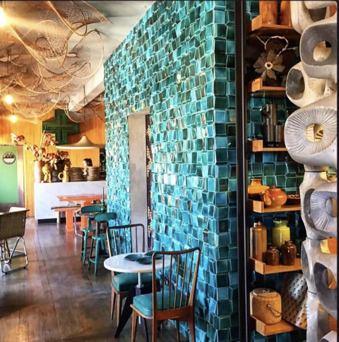
Similarly, I love to blur the boundaries between home design and hotel or restaurant design. Do you love eating out? Do you love the cafe culture? If so, bring those restaurant or coffee shop influences into your kitchen design. We have created a breakfast bar in our kitchen. It has it’s own fridge for butter and milk and we make our breakfast, tea and coffee there in the morning. We have zoned it by tiling right up to the ceiling - a decorating trick I’ve wanted to use for ages ever since I saw it done to especially brilliant effect at Los Enamorados in Ibiza in 2018.

Los Enamorados - Ibiza,

Los Enamorados - Ibiza,

It’s also positioned to make the most of the morning sun coming in through the french doors.

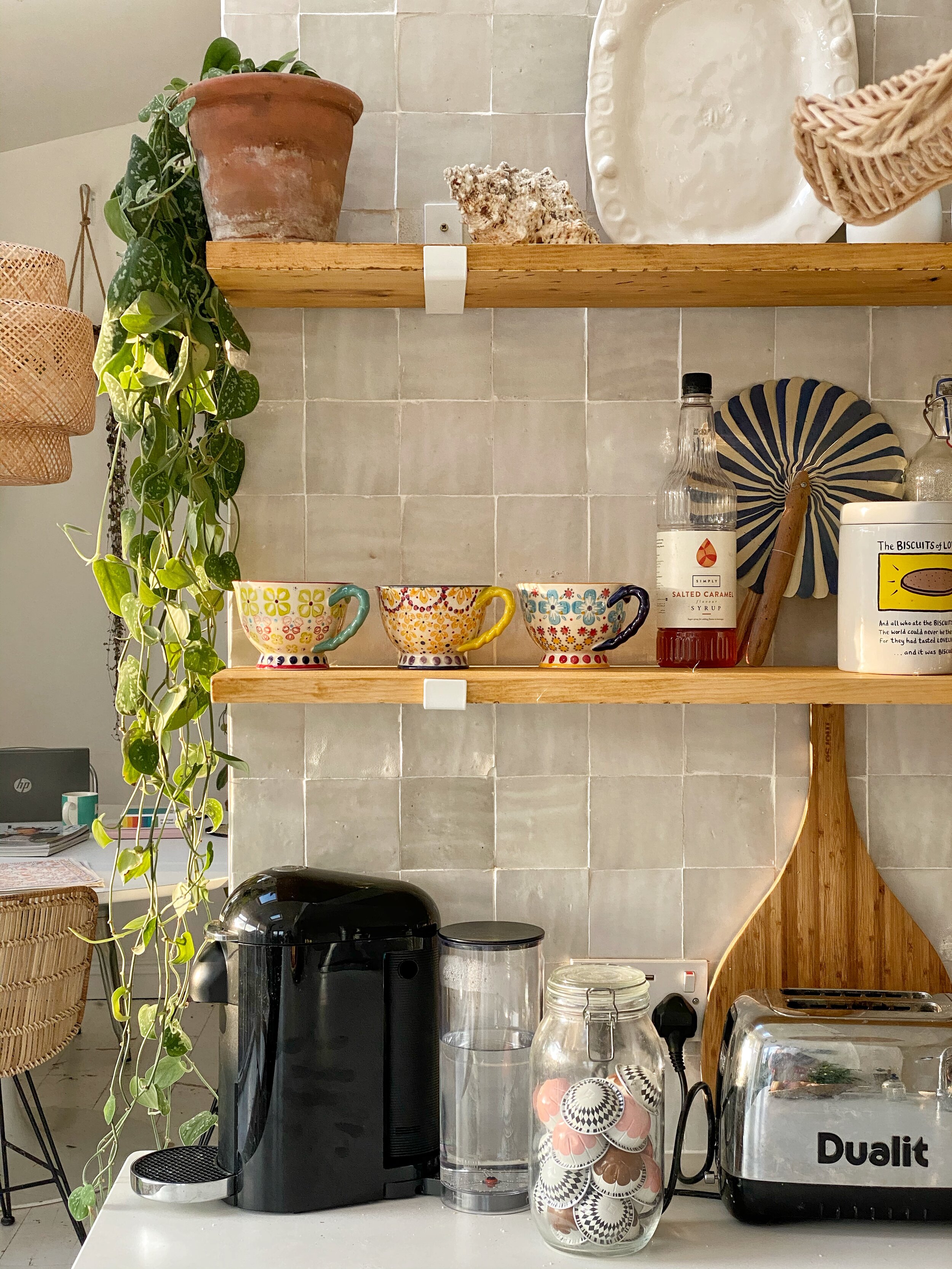
shelfie.jpeg

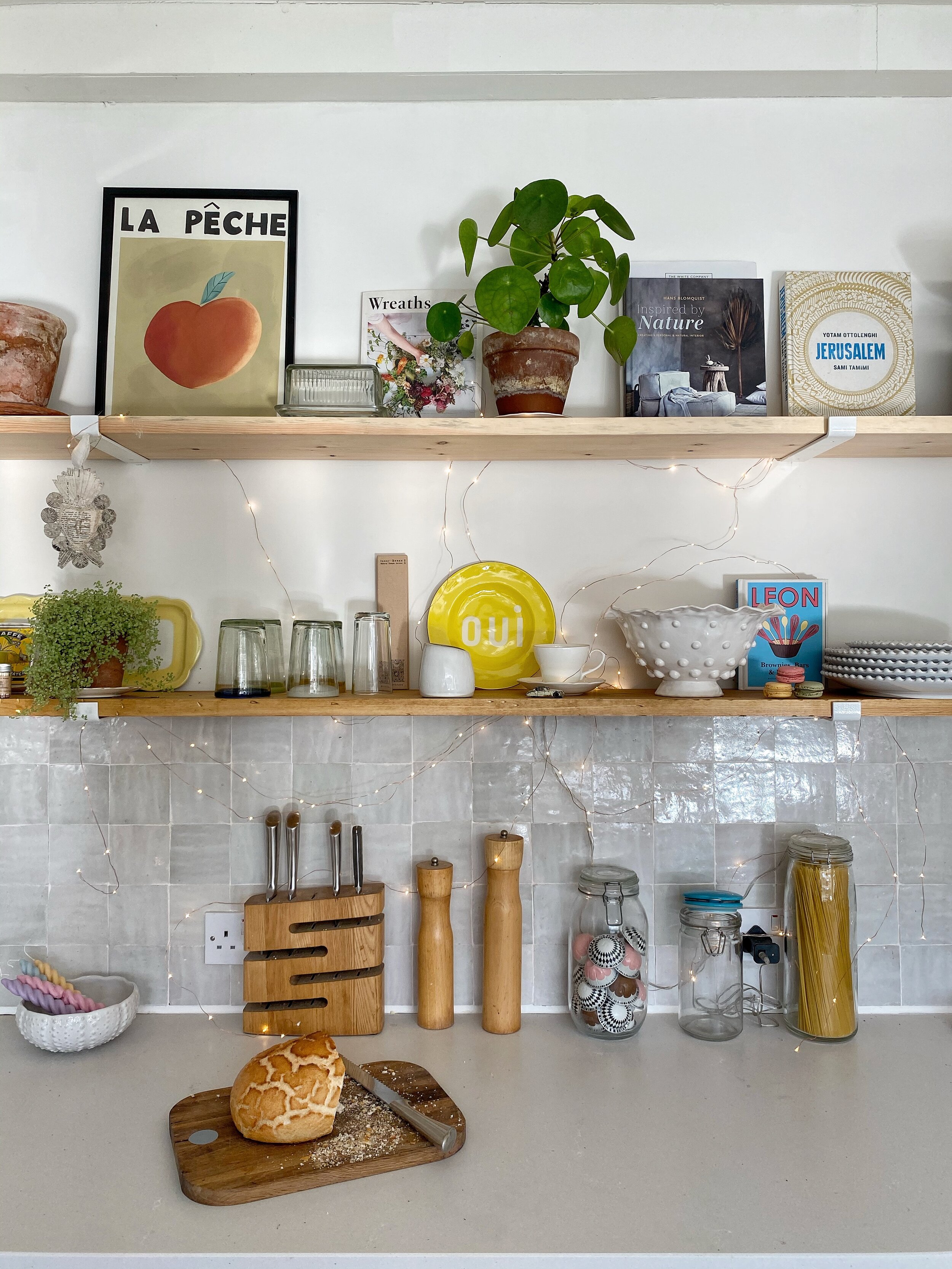
We also have open shelving and the section of shelving here houses the coffee, tea, coffee machine and favourite mugs. Open shelving is my absolute favourite element to any kitchen design as it allow you to surround yourself with what’s important to you. If you love cooking you can have all your favourite pots and pans on display and within easy reach. If you love entertaining you can have all your favourite crockery and glassware on display and within easy reach. The shelves can also zone the kitchen so you can show how the kitchen moves from cooking to entertaining to whatever else you want your kitchen to do for you. Interspersing the items on your kitchen shelves with personal things that you love such as plants, prints, candles and books also makes the space more ‘you’ and less kitcheny.

shelfie 2.JPG

So, our kitchen ticks the ‘Function' box as it completely compliments our lifestyle. It ticks the ‘Form’ box because we’ve chosen materials in keeping with our Victorian house - shelves that emulate the look of stripped pine floorboards, timeless quartz worktop from Caesarstone and limestone flags on the floor. It ticks the ‘Feeling’ box because I feel totally relaxed and happy whilst sitting here.

Another thing that ticks my ‘feeling’ box is coming up with a design that is good value for money. I think it’s worth spending money on something that is going to last or serves multiple purposes but, equally, I don’t think you should spend money if you don’t have to.

For instance, I never recommend paying for bespoke kitchens. I truly believe in designing your own kitchen using Ikea, for instance, and elevating the design with finishes that are important to you. I love Ikea kitchens because they are so flexible and the Metod carcasses have a 25 year guarantee. You could change the doors and drawer fronts every five years, for instance, and create a completely different look. You could also paint the doors for a different look or if you wanted to get creative with colour.

I have elevated the look of my Ikea kitchen using Caesarstone quartz worktop in Fresh Concrete. Not only does it make my Ikea kitchen look high end, it’s hardwearing and will look good forever. This is important to me as my kitchen gets heavy use with three teenagers constantly preparing food and drinks - and they spill a lot of it, all of the time!

kitchen 2.jpg

Knowing that your kitchen is functional, multi-purpose, value for money, beautiful, long lasting and a personal space will, I guarantee you, make you happy. And when all is said and done, creating a space where you are able to be yourself is the most important thing in any design, including kitchens.


Kitchen design in collaboration with Caesarstone. (gifted worktop)

IMG_5148.jpg

Homeware Gift Guide - Christmas 2020

What a year 2020 has been eh? If we’d known this time last year what 2020 would be like I think we’d have all completely flipped out. But with all the unprecedented stress and upheaval has come renewed appreciation, I think, for the things that really matter: health, relationships and looking out for each other.

I haven’t done a gift guide before but I thought that this year I would in order to help support small businesses and also because we possibly have more time this year to choose the gifts that we’re giving for Christmas. After all, our loved ones (that we’ve probably barely seen all year) deserve conciously shopped, thoughful gifts after the year we’ve had. And buying it from an ethical small brand seems more the right thing to do than ever before!

For this gift guide I’ve also focussed on things for now and I think ‘now’ means anything that makes us feel cosy and safe this winter. More than ever, our homes are our sanctuaries and things that make us feel happy at home are absolutely key.

1. Aerende

If you like the sound of #lifeimprovinghomewares you will love this store. Everthing is made in the UK by people facing social challenges. I particularly like the bedding and they have gift vouchers here . I don’t think you’ll find more ethical homeware anywhere. ‘Can you really give bedding for Christmas, Dee?’ I (don’t) hear you ask. Yes absolutely you can, especially this year. Who wouldn’t want the gift of a good nights sleep?

Image: Aerende. The gift of a good nights sleep for Christmas.

Image: Aerende. The gift of a good nights sleep for Christmas.

2. The Basket Room.
You cannot go wrong with basketware - use it for everything - as a plant holder, a bin, a laundry basket, nick-nack storage. Basketware will add warmth and texture to any space. I particularly like this Laini basket and this bike basket. All of the basketware is made by artisans in Africa.

Image: The Basket Room. Everyone knows that bike baskets are purely for Instagram flower shots.

Image: The Basket Room. Everyone knows that bike baskets are purely for Instagram flower shots.

3. Marigold and Lettice

I discovered Marigold and Lettice a couple of years ago and absolutely love her hand made rustic ceramics. There are too many favourites to choose from but this cake stand would be perfect for the baker in your family. Check out her tealight holders too.

Image: Marigold and Lettice. Scallops are everything in homeware this year.

Image: Marigold and Lettice. Scallops are everything in homeware this year.

4. Homeplace

Homeplace has managed to pull off the feat of mixing new and vintage homeware and curating it beautifully. I love Wendy’s taste and the service she provides is second to none. These reeded green glasses stood out to me but everything she sells is exquisite - perfect for difficult- to- buy- for people.

Image: Homeplace. Reeded glass is a beautiful alternative to plain glass.

Image: Homeplace. Reeded glass is a beautiful alternative to plain glass.

5. Maison M London

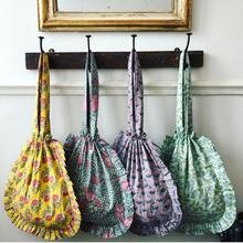
As well as mixing vintage and new homeware, Maison M also sell vintage and new clothing. I love this mix and I love their taste. My favourite from Maison M is this tote bag which not only is super useful as a bag it looks pretty hanging up on a peg rail too. Multi purpose is everything these days.

Image: Maison M. Bags with frills? Give them all to me!

Image: Maison M. Bags with frills? Give them all to me!

6. Curious Egg

Curious Egg ‘where art meets interiors’ was one of my first discoveries on Instagram 5 years ago and, in my opinion, stocks the most exquisite range of homeware, art and giftware that you will find online. Lorraine sources her stock meticulously and every piece tells a story. Her art curation stands out in particular and she’s a huge supporter of graduate artists. I particularly love this Rachel Lee ‘Angel’ limited edition or if you’ve been into The Queens Gambit lately, how about this London Skyline Chess Set.

Racel Lee Angel 2.

Racel Lee Angel 2.

7. Poppy & Honesty.

Talking of the gift of sleep, Poppy and Honesty’s Liberty fabric cushions and sofa toppers are the perfect addition for an extra comfy sofa this winter / lockdown. Not only do they protect your sofa, they provide extra comfort and enable daytime napping - which of course is totally allowed in the winter. In fact, it’s the law.

Image; Poppy and Honesty. Enabling nana naps since 2007.

Image; Poppy and Honesty. Enabling nana naps since 2007.

8. The Jacksons London

The Jacksons has been on my radar for years as a source of quirky homeware and fashion. I especially love their jute bags. I know bags aren’t strictly homeware but they’re multi-purpose and in my mind serve as art too when hung with purpose.

Image; The Jacksons. Love wins every time.

Image; The Jacksons. Love wins every time.

9. Catherine Colebrook
Catherine Colebrook is an emporium of wonderment and she mostly specialises in personalised pieces such as these Liberty artworks. However the gift that caught my eye the most this year is this eyemask which says EVERYTHING about 2020!

FUCKOFF2020NAVYLINEN_2048x.jpg

10. Domestic Science

Domestic Science is an independent department store selling a quirky and unusual mix of contemporary lifestyle products and vintage homeware. To my mind, Domestic Science up there with Petersham Nurseries and Baileys in how they curate and visually merchandise their mix of independant suppliers. They’ve recently gone online and also operate a click and collect service. I particularly like their multi coloured towels and their twirly candles by Esh.

Image: Domestic Science. Peach twirly candles of dreams.

Image: Domestic Science. Peach twirly candles of dreams.

Anyway, that’s my take on homeware gifts for Christmas 2020. There is absolutly no need to buy things from Amazon - these independant stores are super reliable and quick at delivering their beautifully curated items. Let’s make 2020 the year we ditch convenience for conciousness.

How I Created our Outdoor Room

The first incarnation of the garden room.

The first incarnation of the garden room.

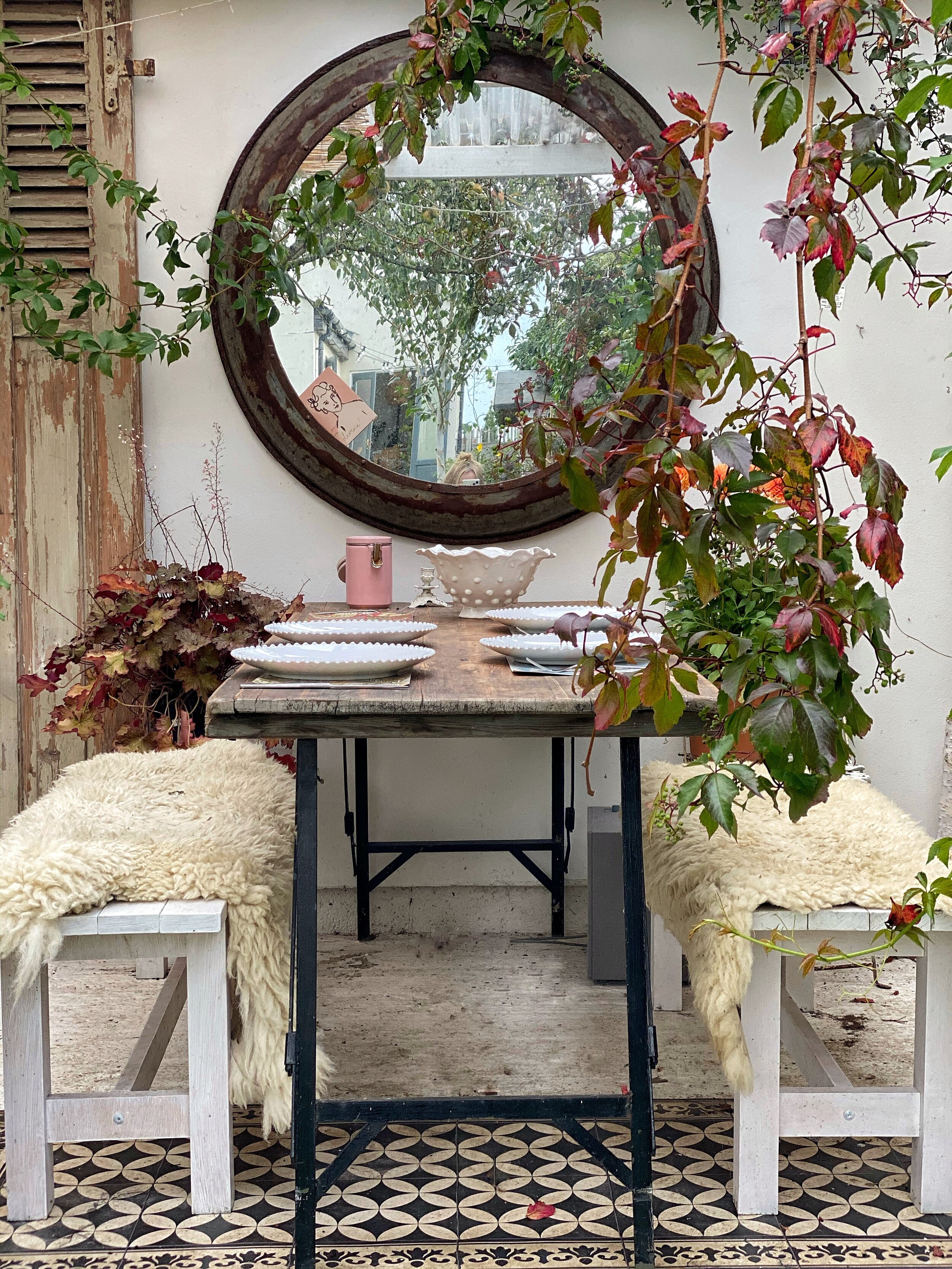
If you’ve followed my Instagram account for a while then you’ll know that I’m a massive fan of bring the oudoors indoors and vice versa. I strongly believe in treating any space as a room, including spaces such as sheds, verandas, balconies and summer houses. (I also think you should treat transitional spaces like hallways and corridors in the same way but that’s a topic for another blog post).

Three years ago I was invited by Cuprinol to colaborate on an outside space project. I leapt at the chance and we built a garden room against the garage using only B & Q products, Cuprinol paint and a £500 budget. The blog post all about how we did it is here.

We’ve improved and added to the space over the years and I’ve been asked lots of questions on Instagram about it so I thought I’d do an update on what we did next!

  1. Floor

    Our £500 budget didn’t stretch to a permanent floor for the campaign but this was fine as it gave me time to think about what I really wanted. I wanted something that hardwearing (obviously) and light coloured to keep it feeling light down there. I also wanted it to be something that would work with different looks and not dominate the space in any way. After toying with the idea of tiles for a while (too expensive) I settled on the cheapest and easiest option - a concrete slab. This was just a case of hiring a cement mixer and pouring the cement mix in the floor space which was shuttered off by scaffold planks. I didn’t document this but here’s a good YouTube video on how to do it. Once dried, we painted the floor with white garage floor paint. This is hardwearing and created the light and airy feel I was after. And because I like to treat outdoor rooms as real rooms, I often use rugs to zone or soften the space.

    2. Roof

    We’d chosen corrugated bitumin for the roof as it was low cost and hard wearing. Another benefit was that it was quiet when rained on - a lovely muffled noise. However, over the years it became obvious that the roof made the space too dark and also prevented the grass from growing in front of the space as it was permanently shaded by the roof. Then during the winter one corner of the roof collapsed - not as long lasting as we’d thought - so it was time to replace it. My ideal solution would have been some beautiful reclaimed summerhouse glass like this:

Beautiful conservatory. Image: Pinterest.

Beautiful conservatory. Image: Pinterest.


However, this is hard to source and very expensive so I settled on corrugated perspex which was £70 in total from Wickes. It was easy to fix to the existing frame and the room was immediately filled with natural light. This will make it much more amenable to growing plants and vines, however, the look is quite stark which leads me onto the solution I already had lined up for this.

Corrugated plastic roof. Lets lot of light on but can be a bit sterile looking.

Corrugated plastic roof. Lets lot of light on but can be a bit sterile looking.

3. Reed Screening

I’m always massively inspired by Petersham Nurseries and the glass roof of their Richmond nursery is lined with bamboo blinds. This is for practical reasons, as well as aesthetic, as it shades the planted from intense sunlight. But how great does it look and how easy is it to achieve?!

Pettersham.jpg

Instead of bamboo blinds I ordered 2m x 4m reed screening from UK Garden Products and also reused some existing reed screening we already had covering a fence. We’ve only partially covered the roof, where shade is needed, and we may add more. As with most things, we’ll live with it for a bit and see how it works out.

Reed screening is a cheap and effective way of discguising corrugated plastic.

Reed screening is a cheap and effective way of discguising corrugated plastic.

4. Kitchen

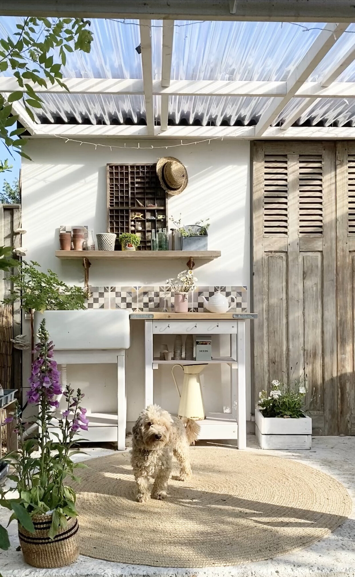
I’ve tried to zone the outdoor into three distinct areas - dining area, as seating area and a kitchen! We already had an old belfast sink that had been in the garden for years (it was my grandmothers) so Rob mounted it onto a frame to create a sink unit. We then plumbed in a cold water supply and added tiles left over from a previous collaboration with Bert aand May. We added a shelf made of scaffold planks and reclaimed cistern rackets and Rob also made a kitchen unit from an old bunk bed, again topped with old scaffold planks as the ‘worktop’. I use this area for plant care and propagation usually but when we have friends round it becomes a real kitchen and food preparation area for the barbeque.

Reclamed belfast sink, reclaimed tiles and reclamed scaffold planks to create an outdoor kitchen. (Peonies optional unless you’re on Instagram in which case they are the law!)

Reclamed belfast sink, reclaimed tiles and reclamed scaffold planks to create an outdoor kitchen. (Peonies optional unless you’re on Instagram in which case they are the law!)

5. Gutters

You might think that guttering wouldn’t be needed in on such a small space. We didn’t and only included a french drain when we first built the outdoor room ( a shallow channel dug around the perimeter of the building and filled with gravel for fast drainage.) However, the french drain wasn’t up to the job in heavy rain and caused lot of water to splash back into the room and soak the rugs. So we added a white gutter and drainpipe that blended in with the woodwork.

White guttering was the only acceptable option and it is now pleasingliy disguised with Virginia Creeper.

White guttering was the only acceptable option and it is now pleasingliy disguised with Virginia Creeper.

So that’s been the main changes we’ve made to the garden room. It has been used SO much over the last three years - as a dining space, an office space, a teen hang out area to name but a few. I’m glad we kept it neutral because it’s allowed us to create a different look and configuration whenever we’ve felt like it. It’s also been used as a location shoot for brands and even appeared in a book Selina Lake Shed Style.

The best decision we made though was to include a sold roof in the design. The weather in the UK is so unreliable that it’s a must really if you want to use the space for as much of the year as possible. The solid roof also means that you are not limited to using only traditional outdoor furniture in your outdoor room. The roof protects the furniture to a large degree and this opens up many more furnishing possibilities. We have a vintage leather sofa and an ex-army mess table as our furniture in the garden room and both stay out all year. The sofa is fairly battered now but has given us three years service and probably lasted as long as an expensive outdoor sofa that isn’t under cover. For me the priority was a space that made me feel happy and completely relaxed and, as with any interior, I only get that feeling by surrouding myself with well loved pieces.

I hope that this blog has helped if you’re thinking of building an outdoor space. I really recommend them - they don’t have to be expensive and the benefits thye bring to your life are worth every penny anyway.

outdoor Room Floor.jpg


How to Create a Virtual Gallery Wall.

Do you love gallery walls but are not sure how to do them? Do you lack confidence in putting them together wihout it looking like like a mish mash. Using just Microsoft PowerPoint this is a super easy but useful way of trying out art on your walls before committing to a purchase or banging a nail in the wall. There are other ways of doing it but this is how to do it using just a smartphone, a laptop and Microsoft PowerPoint.

Step One.

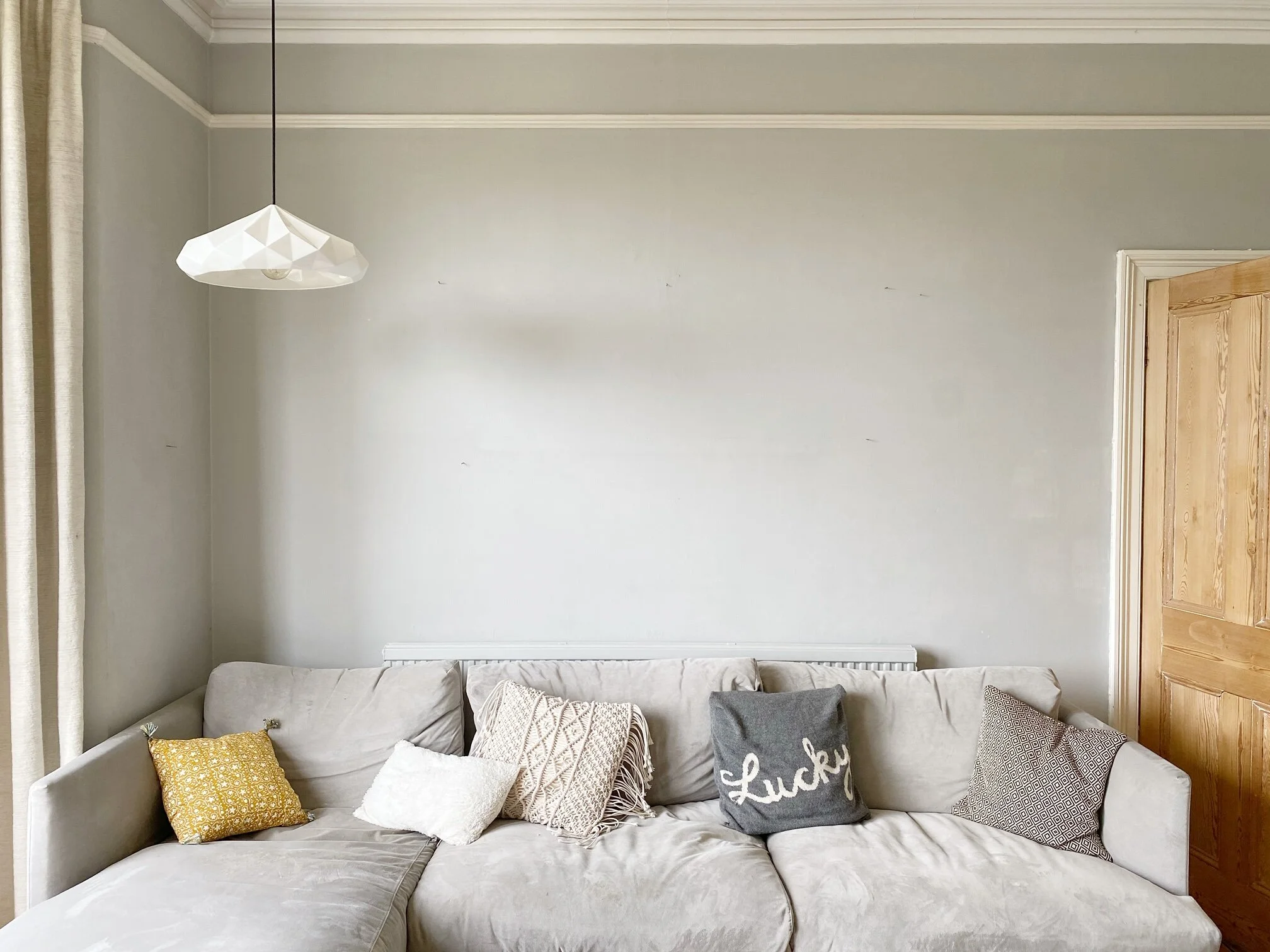
Empty the wall of all other art and take a photograph of your wall. Make sure the photgraph is straight on - no angles or sloping lines. Take it as a landscape photograph and include the accent colours you use in that room, i.e, the cushions, throws, wallpaper you have in that room.

My living room.

My living room.

Step Two.

Save your photograph onto your PC in the way you normally would. Then open PowerPoint and insert your photograph as an image into a new PowerPoint presentation. Stretch it out and enlarge if to fit the PowerPoint page. Keep this page open.

Paste the image into Powerpoint.

Paste the image into Powerpoint.

Step Three.

Have a lovely long trawl through all of your favourite online art stores. My favourites include:

The Poster Club - a Copenhagen based online store offering high quality posters, prints, frames and original art.

Society 6 - a US based online store offering posters, prints, frames and original art by little known artists. (Be careful of import tax.)

One off to 25. - A UK based online gallery of beautifully curated original and limited edition art.

The Medium Room - A UK based online gallery of vintage art.

Homeplace - A UK based store stocking a beautifully curated mix of new and vintage prints and art.

Rockett St George - A UK based store selling an eclectic mix of prints and posters.

Tate - Our favourite gallery, The Tata Shop sells prints of many of the images in it’s collection.

Save the pictures that you like by either:

  1. On your phone, right clicking on the image and ‘Add to Photos’ thus saving it to your camera roll (if it gives you the option).

I clicked in this image on Rockett St George and saved it into my camera roll.

I clicked in this image on Rockett St George and saved it into my camera roll.

2. If you don’ t have the option of saving the image to your camera roll then use the Snipping Tool app on your laptop to virtually cut the image out and save it to a gallery wall directory. Snip them including a the frame if possible.

Microsoft Snipping Tool - the most underrated tool ever!

Microsoft Snipping Tool - the most underrated tool ever!

Step 4

Save all of your images into a new directory. At this point it would also be a good idea to photograph and save images of art you already have and would like to use in a gallery wall.

Step 5

gallery wall 7.jpg

Click ‘Insert’ ‘Picture’ and find one of your pieces of art. Click on it and it will appear in your open PowerPoint slide of your empty wall. You can move it around with your mouse and resize it as much as you want.

Image inserted into my Powerpoint slide.

Image inserted into my Powerpoint slide.

Step 6

Keep inserting images from your directory of saved images. Move them around. See what looks best together. If pieces don’t look good together, try another combination. Think about adding a piece of simple graphic art or typograpy in between two more detailed or colourful images - it rests the eye and let’s you appreciate the art more when they’re punctuated by something simple.

gallery wall 8.png
Gallery wall 10.jpg

Step 7.

If you want to get technical you can re-size the images roughly to scale, depending on what sizes the art comes in. You can also add frames of any colour and thickness by using the ‘Format’ ‘Picture Styles’ and ‘Picture Border’ facilities in PowerPoint.

gallery wall 11.JPG

That’s it! It’s so easy as you can see and once you get the hang of it you can use this same idea to look at lighting, cushion or coffee tables in situ before buying.

Let me know how you get on, tag #fantasygallerywall on Instagram and I will Story them


Gallery Walls

Gallery walls have been big news over the last few years. The explosion of affordable art print companies on Instagram means that there has never been more art to choose from and with a gallery wall you can mix up all of your fabulous choices into one big display.

Galllery wall by the Queen of gallery walls @_Lisa_Dawson_

Galllery wall by the Queen of gallery walls @_Lisa_Dawson_

But how do I curate my gallery wall like Lisa’s without it looking like a giant mash up I hear you ask? Well, there are a few considerations but this should also be balanced with not overthinking it too much either.

Step 1

Only choose art that you really, really love. Look at Lisa’s gallery wall above. She’s mixed family photos with oil paintings, typography and posters and it works for four reasons.

  1. She loves every piece and each one is part of her personality.

  2. She’s chosen only black, white or wood frames. This gives the gallery wall some cohesion.

  3. She’s pulled out some of the colours in the gallery wall with the colours of the cushions on the sofa which creates harmony.

  4. The pictures are hung so that together they form a rough landscape but, Lisa being Lisa, a couple of are slightly off. This ‘quirk’ works though because she likes quirky things and this makes her feel happy at home.

Step 2

Know your core style. Lisa is the queen of the ECLECTIC interior - she’s a natural at mixing the old with the new and this makes her very happy in her home. However, your core style may not be the same. Ask yourself how you want to FEEL at home and this is how you start to work out your core style. I love old and new too but I also like to feel very calm at home and my first love is Scandinavian inspired light coloured rooms.

My muted gallery wall in the dining room.

My muted gallery wall in the dining room.

My gallery wall therefore is much more pared back than Lisa’s. I’ve stuck to a colour palette of black, white and mustard and all the frames are black. I’ve introduced a little bit of quirk with the random wall plate and by using yellow washi tape to hang some of the prints but again these elements are firmly within the colour palette. This keeps the gallery wall looking calm and harmonious. The whole gallery wall forms roughtly a portrait shape but not quite - again the elements of quirk in my gallery wall allow this.

So what is your core style? Do you favour a traditional interior, .a mid century interior, a shabby chic interior or a contemporary interior? Are you a minimalist or a maximalist? There are loads of interior styles of course and it’s likely that you like different elements of several of them (I know I do!) but let’s just look at a couple of them and how they might influence how you arrange your gallery wall.

Traditional.

If you like traditiional interiors then you will favour symetry and muted colours like beige and navy. You will like everything to match and you will like the room to feel ordered. If this is the case then this sort of gallery wall will be for you:

Source: Pinterest.

Source: Pinterest.

This gallery wall works as all of the frames are the same colour and size, the images are all the same size and the whole gallery forms an orderly grid. This sort of gallery wall is very easy to achieve and is very easy to live with. Although it is traditional, it would look great in a Scandi interior, a minimalist interior or a comtemporary grey interior. It is an excellent ‘starter’ gallery wall if you’re nervous about tryiing one. You could also adapt this to suit you if you like some elements of the traditional style but not all of it. Think about using just the grid arrangement, or just the black and white art, or just the black frames as the element that pulls your gallery wall together.

Contemporary

If you favour a contemporary style then you will like a lot of the mid century modern furniture around at the moment - low profile sofas and chairs and, again, muted colours but more towards the whites, greys, and blushes. If this is the case then you may prefer this sort of gallery wall:

Source: Desenio

Source: Desenio

This gallery wall works as all the frames are the same colour - pale wood - and all the images are within a grey white and pink colour palette. The gallery wall arrangement is less formal but because all the colours are harmonious then it still looks very cohesive. Also, if you look at the arrangement, there is always one line per piece that is at the same level as it’s neighbour. This gallery wall would work very well in a traditional, contemporary, Scandi or mid century interior. Again, you can adapt it to suit your own taste - think about using frames that pick up on the colour of the wood you already have in the room (I like to stick to one wood shade in a room) or think about using some metal frames if you have gold or chrome accessories in the room (again, I prefer one or the other, not both coloured metals).

Step 3

Do you want your gallery wall to dominate or blend in with the room? Again, this goes back to your core style and how you want to feel in the room. If you want it to dominate then think about using a few of the tricks mentioned above - clashing colours, genres of art or mixed frame colours. The more you mix these elements up, the more eclectic and maximalist your gallery wall will look and the more it will dominate a room. If you want it to blend in and not ‘fight’ with other furniture or colours in your room then think about what you already have in that room and use materials and colours that match. The more minimalist you are, the more pared back your art colours and frame choices should be. I personally don’t think it matters about the genres as long as there is a frame or colour linking each of the images in your gallery wall.

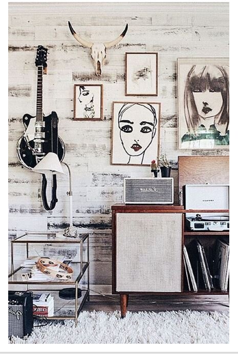
An electic gallery wall that is still cohesive as it uses matching frame colours and themed images (female faces). The addition of a guitar and skull are quirky but it still doesn’t dominate the room because of the neutral colour palette. Source: Pi…

An electic gallery wall that is still cohesive as it uses matching frame colours and themed images (female faces). The addition of a guitar and skull are quirky but it still doesn’t dominate the room because of the neutral colour palette. Source: Pinterest.

Step 4

Do you want to add to or draw attention to the height or width to your room? If you have a tall, skinny room then think about arranging your gallery wall in a landscape arrangement as this will make the room seem wider. If you have a short, wide wall then think about arranging your gallery wall in a portrait style as this will make the room seem taller.

This portrait arrangement of art shows off the scale and height of this room and the darkest colour and biggest picture at the top also draws your eye up. Source: Pinterest.

This portrait arrangement of art shows off the scale and height of this room and the darkest colour and biggest picture at the top also draws your eye up. Source: Pinterest.

So, it’s a bit of a minefield and as I said, you don’t really want to overthink your gallery wall as you’ll get paralysed! However, if you:

  • Choose art that you love.

  • Frame it according to your core style and existing room colours and materials.

  • Arrange it according to your core style - formal or minimal to eclectic or maximalist and all the nuances in between.

  • Think a little about what your room needs in lines and scales.

Then you can’t go far wrong! Mostly, though, just go for it, be brave and give it a try. Hooks and nails can be moved and filled or you can use Command picture hangers if you’re worried about knocking nails into the wall.

Practice makes perfect and it’s not until you actually try these things that you’ll know what you like. Good luck!


Distressed Painted Walls

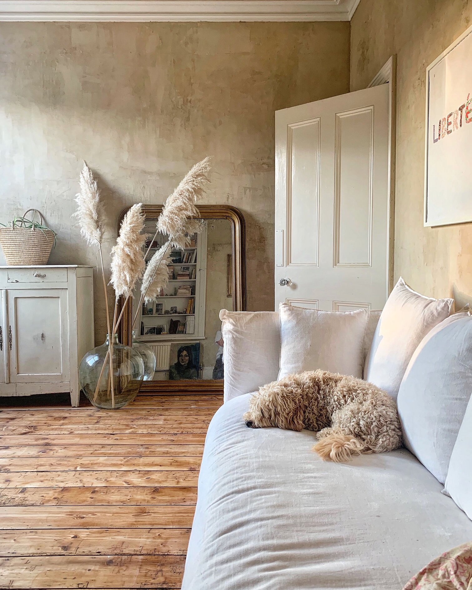
Study painted in Autentico Volterra ‘Paris White’.

Study painted in Autentico Volterra ‘Paris White’.

Probably the question I get asked the most is how I achieved the distressed paint effect in my study. I’ve had a go at most paint effects over the years - stippling, colour washing, rag rolling, to name but a few. Most can be done with ordinary emulsion but it’s not easy to get a really authentic looking distressed finish. The product I used for my study was a completely new and very exciting product by Autentico called Volterra. Volterra is a 100% mineral plaster paint so it’s actually less of a paint and more a plaster veneer. It looks so much more authentic than paint as it is effectively a thin layer of plaster. And because it’s more plaster than paint, you can work it with trowels and sandpaper to create different finishes. I wanted a shabby, parisian apartment look and here’s what I did to achieve it.

You will need:

Autentico Velvet paint

Autentico Volterra paint in same colour

A paintbrush

A clean, square edged trowel

A damp cloth and pot of water.

Firstly, I applied a coat of Autentico Velvet in Paris White. Velvet is a chalk based paint with excellent coverage. It covered the previously dark grey wall in one coat.

Autentico Velvet in Paris White.

Autentico Velvet in Paris White.

Once this was dry I applied a coat of Volterra in Paris White. Volterra has a very thick, gooey consistency. I applied a coat of about 1 metre square at a time.

Apply Autentico Volterra.

Apply Autentico Volterra.

Once the Volterra is applied you have about 10 minutes to work with it before it dries. To achieve the distressed effect you skim over the Volterra coat with a trowel. Use sweeping actions side to side and up and down. Wipe the trowel with a wet rag every few strokes to removed Volterra build up on the trowel. The more you ‘work’ the Volterra the more distressed the overall effect will be. It takes a little practice but after a few minutes you should have your technique sorted and you will soon realise that you can’t really go wrong!

Skim over the Volterra with a flat sided trowel.

Skim over the Volterra with a flat sided trowel.

Applying the Volterra and skimming over it with a trowel is pretty labour intensive but you can make it easier by buddying up with someone - one of you applies the Volterra and one of you skims over it with the trowel.

Once you’ve finished a wall or area it will look like this:

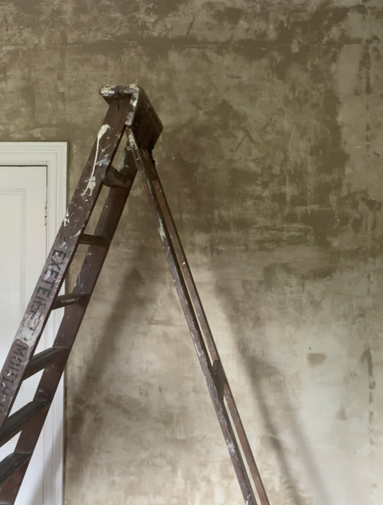
Freshly painted Volterra wall.

Freshly painted Volterra wall.

The freshly painted wall will look very patchy and quite dark. However, it dries much lighter, as in the picture below. Once dried, if you want more of a polished plaster look you can buff the wall with a fine grain sandpaper or electric sander.

distressed wall.jpg

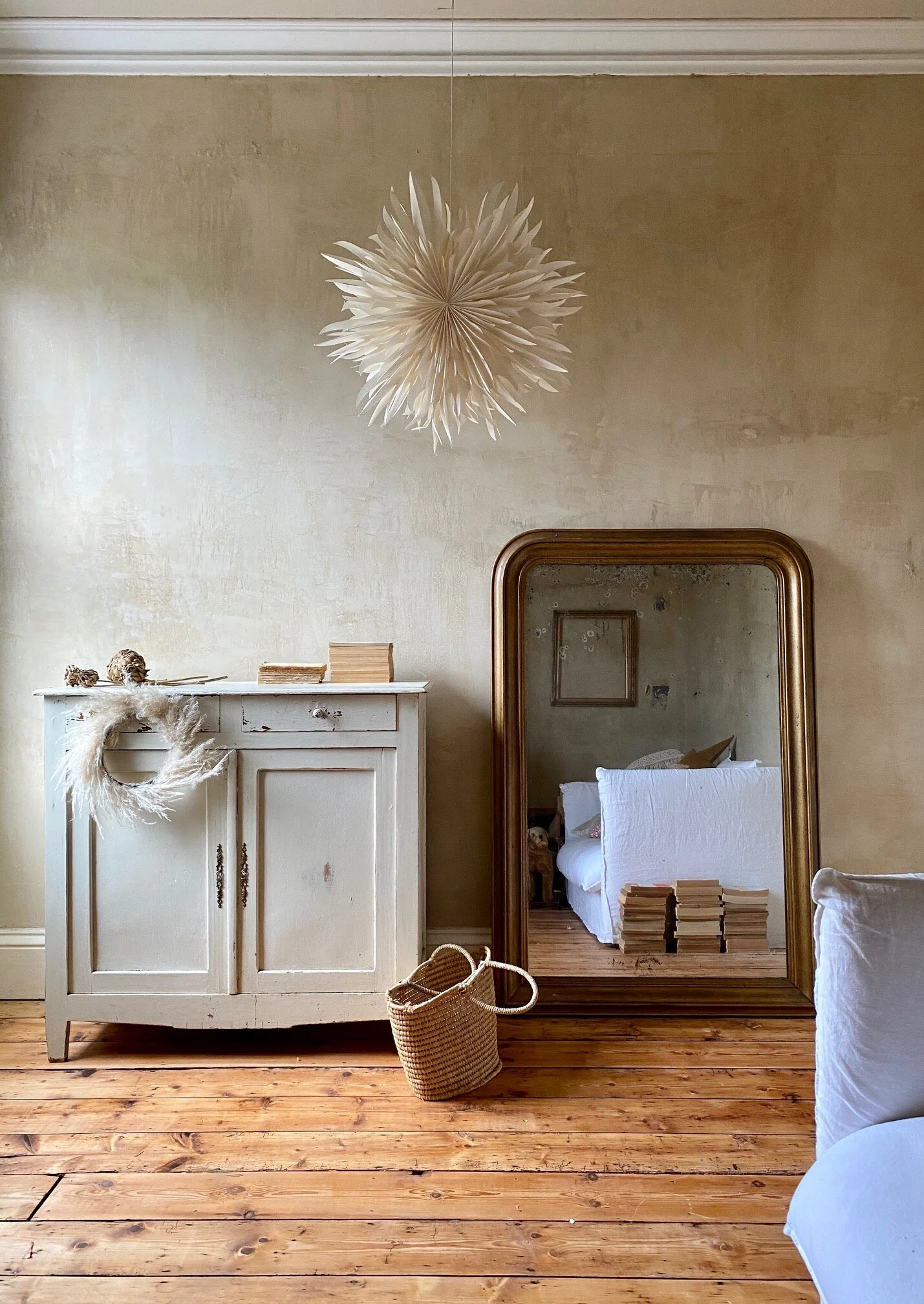
This is exactly the shabby Parisian look I was hoping for and it was pretty easy to achieve. It’s obviously more labour intensive than a straighforward paint job but the extra effort is well worth it. Absolutely everything looks great against the wall and it adds so much character and depth to the room. It looks especially good in period properties.

The light coloured Volterra paints emulate the look of moroccan plaster work, otherwise known as Tadelakt, and the grey coloured paints emulate the look of polished concrete. Both Tadelakt and polished concrete are very expensive finishes so the fact that Volterra can emulate this look at a fraction of the price is very exciting. Even more exciting (although I havent tried it yet) is that the Volterra finish can then be sealed and varnished to become waterproof. This means that you can use it in many other situations, for instance:

  • create polished concrete effect counter tops (simply paint and varnish your old laminate counter top).

  • paint and seal a floor to create a polished concrete floor.

  • paint and seal the bathroom Tadelakt style thus no need for tiles.

There is a step by step guide to this wall on my Instagram Story here and if you have any questions about the product DM Layla at Autentico - she is super helpful.

This blog post is not sponsored by Autentico.